There is a saying in “new school” photography something like There are no real rules of composition, do what feels right.
I’m old school. I tell my students, however, that there are rules, and those rules can be bent as far as needed for the effect you’re trying to create with the image? What story are telling, what emotions or ideas are you communicating? Elation? Joy? Sorrow? Harmony? Symmetry? Discord? Beauty?
This image is a great example of classic composition, involving pattern, with a pattern interrupting element:

This image of the man kicking the soccer ball uses a centered balanced composition. Rule of thirds kicked away:

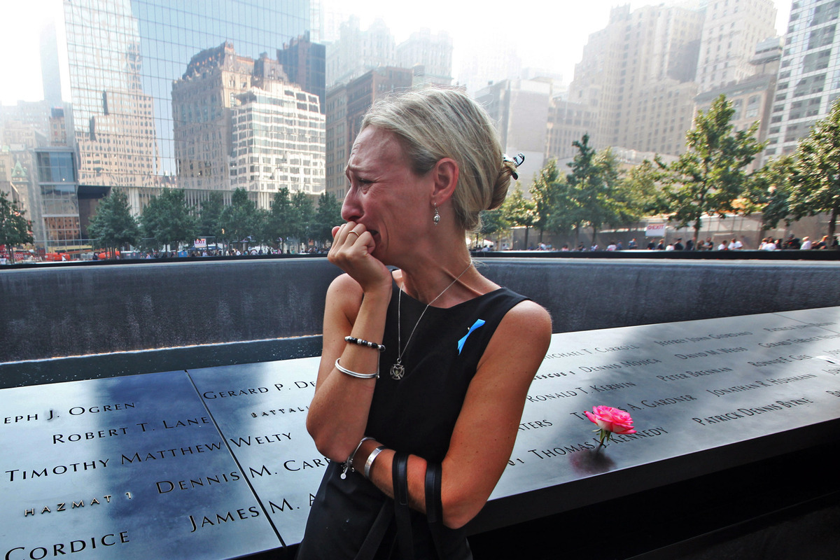
This image of a woman mourning her fiance years after the events of 9/11 in Manhattan, shows a discordant composition, the woman looking out of the frame.

Which of these works with the composition and why? What moods are they conveying? Do any of these images have a composition that doesn’t match the mood or emotions that the photographer is attempting to communicate? Why or Why not?
I tell my students that in order to break the rules and succeed in communicating your message, you have to master the rules of composition and understand why the Golden Ratio and the Rule of Thirds matter for a pleasing composition… Why action moving into a frame usually works best… Why centered composition indicates symmetry and balance…
This collection of images is sure to end up in my class, provoking discussion, and, hopefully, getting the student to THINK about their composition when they press the shutter release, and afterwards in post-processing.
You have to master the rules, in order to break them with style.