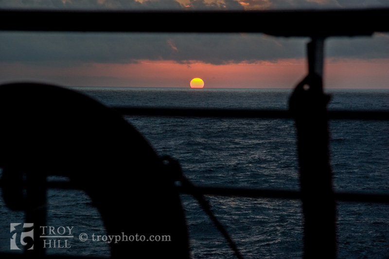
Note: I originally published this little piece several years ago. I’ve bumped it up in the blog to add some more vacation photo content at the top of the blog.
Anyone familiar with basic composition rules knows “Don’t put the horizon in the center of the image!”
You can use the horizon in design and photography to your advantage.
This image has the horizon at the bottom third of the image. The coastline appears close at first glance.
Same sky, same ocean, different sunrise but the horizon moves to the upper third, increasing the visual perspective of how far one has to travel to reach the horizon.
Just by moving the horizon up or down in the image can change the viewer’s perception of how “far” the distance is perceived.
